The Center for Systems Science and Engineering (CSSE) at Johns Hopkins University provides the famous Corona Dashboard and Map (ESRI ArcGIS Online App) and an ArcGIS Feature Service with the recent data (and a GIT Repo with the raw data). The ArcGIS Feature Server support of QGIS makes it easy to have “some fun” with QGIS and the provided datasets.

Add the data to QGIS
Recent releases of QGIS allow adding data from ArcGIS Feature Servers. CSSE provides the data used for the worldwide dashboard as a Feature Service.
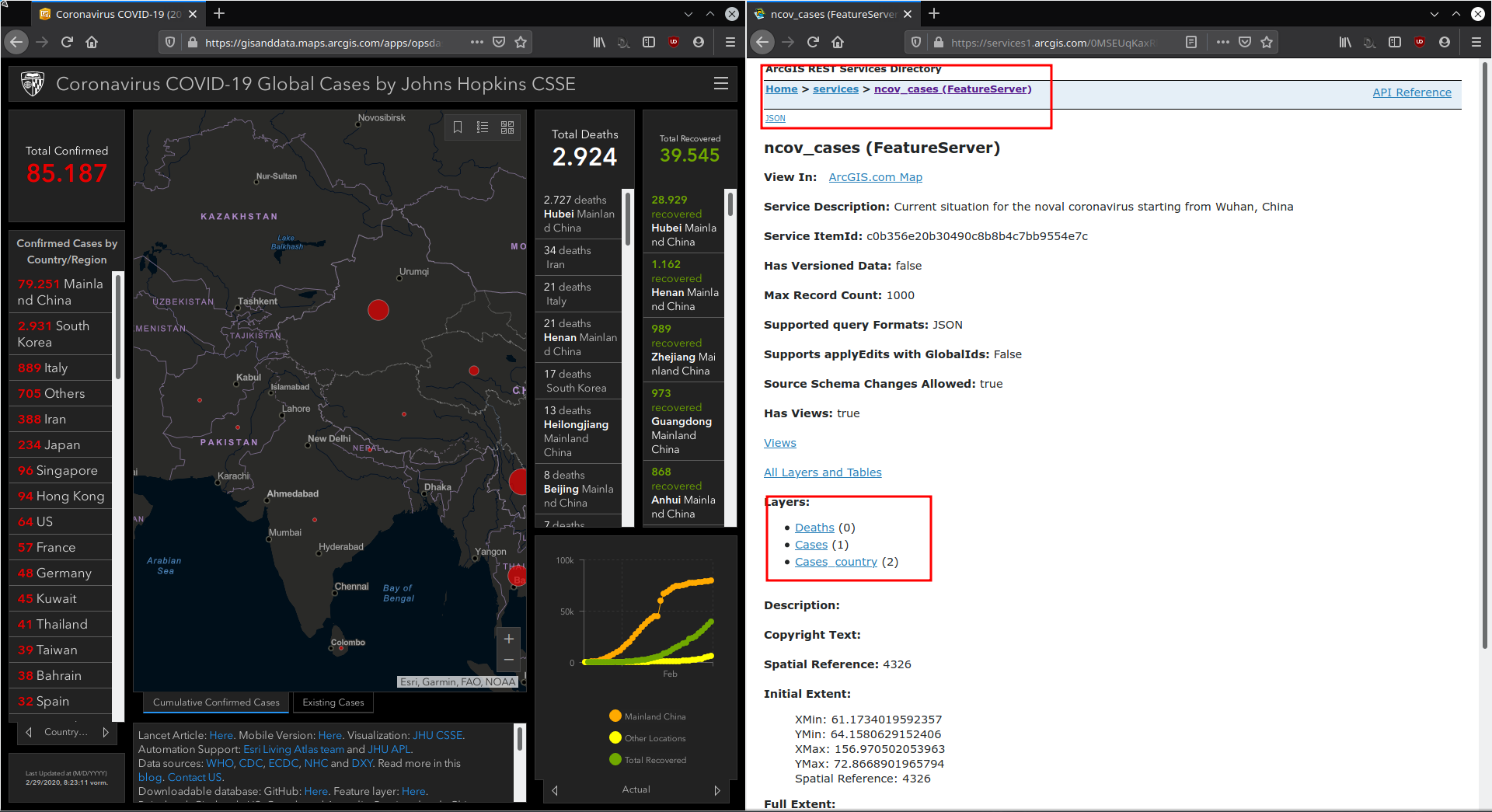
The REST service provides 3 layers:
- Deaths (0)
- Cases (1)
- Cases_country (2)
To add the layers to QGIS just open the data source manager and add a new ArcGIS Feature Server connection with the provided service URL provided by CSSE.
The service URL: https://services1.arcgis.com/0MSEUqKaxRlEPj5g/ArcGIS/rest/services/ncov_cases/FeatureServer

After connecting to the service, the 3 layers are provided.
Some simple first steps…
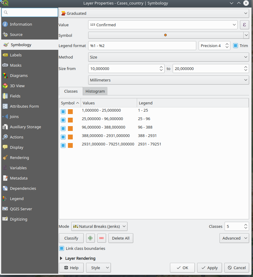
Scaled circles based on the number of confirmed cases
- Change the symbology to “graduated” (method: size) and choose the options (classes, mode,…) based on your needs
Change the color of datapoints with cases of death
- QGIS expressions allow some nice and simple styling options – in this case the scaled circles should be red in countries where people already died. This could be done by a rule-based symbology or “quick & dirty(?)” with an expression on the used color:

if(("Deaths" = 0),'#ec8927','#ff0000')
Label the percentage of cases of death
- Expressions can also be used within the labeling options – in my case I just wanted the number of confirmed cases and the percentage of cases of death labeled inside the circles (datapoints).
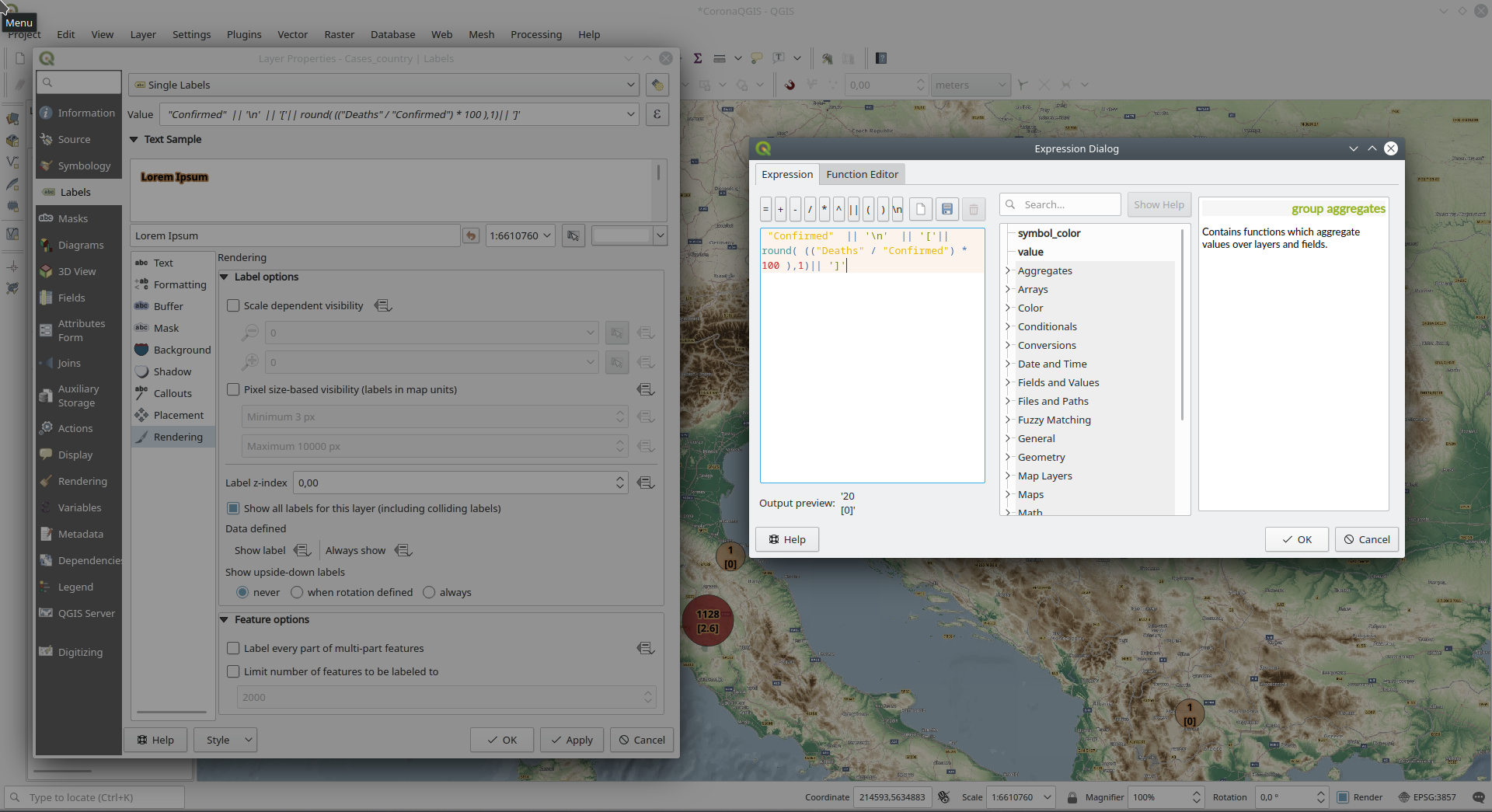
"Confirmed" || '\n' || '['|| round( (("Deaths" / "Confirmed") * 100 ),1)|| ']'
- What the expression does…
- Label the attribute “confirmed”, concatenate (||) a line-break (\n), in the next line start labeling with a ‘[‘ and add the calculated percentage ((“Deaths” / “Confirmed”) * 100 )) with just one decimal place (round(…),1) and finish with the label with a ‘]’
More on QGIS expressions: https://docs.qgis.org/testing/en/docs/user_manual/working_with_vector/expression.html